treemind.plot
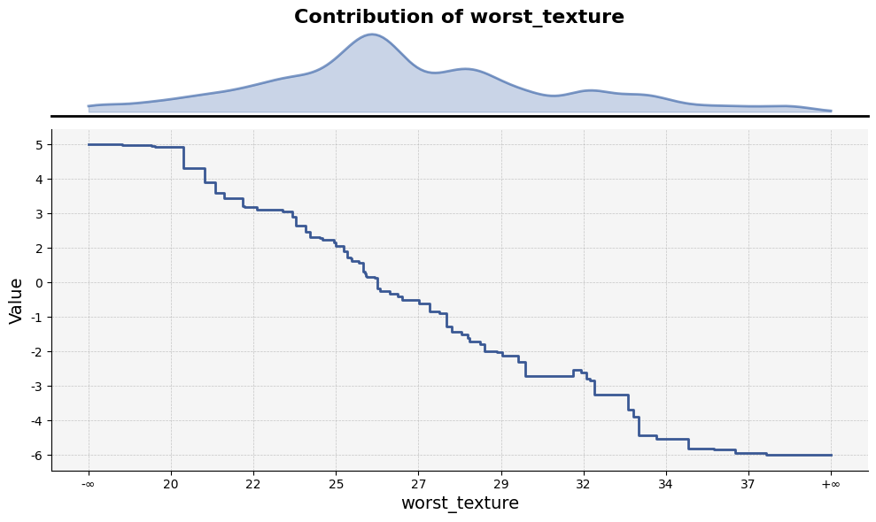
- treemind.plot.feature_plot(df, figsize=(12.0, 8.0), show_std=False, show_range=True, xticks_n=10, yticks_n=10, ticks_fontsize=10.0, title_fontsize=16.0, label_fontsizes=14.0, title=None, xlabel=None, ylabel=None)
Visualizes feature statistics across ranges defined by tree split points. The plot includes the difference from the mean, optional standard deviation, and the distribution of feature counts for each tree split point range.
- Parameters:
df (pd.DataFrame) –
- DataFrame containing the feature data with the following columns:
’feature_lb’: Lower bound of the feature range (tree split point).
’feature_ub’: Upper bound of the feature range (tree split point).
’mean’: Mean value of the feature within this range.
’min’: Minimum value of the feature within this range.
’max’: Maximum value of the feature within this range.
’count’ : Average leaf_count within this range.
figsize (tuple of float, default (12.0, 8.0)) – Width and height of the plot in inches.
show_std (bool, default False) – If True, shaded areas representing the standard deviation values will be displayed.
show_range (bool, default True) – If True, show leaf distribution within range.
xticks_n (int, default 10) – Number of tick marks to display on the x-axis.
yticks_n (int, default 10) – Number of tick marks to display on the y-axis.
ticks_fontsize (float, default 10.0) – Font size for axis tick labels,
title_fontsize (float, default 16.0) – Font size for the plot title.
title (str, optional, default None) – The title displayed at the top of the plot. If None, no title is shown.
xlabel (str, optional, default None) – Label for the x-axis. If None, it will default to the feature name.
ylabel (str, optional, default None) – Label for the y-axis. Defaults to “Value” if not specified.
label_fontsizes (float)
- Returns:
Displays the plot.
- Return type:
None
Example Usage
Below is an example of how to use the feature_plot function:
from treemind import Explainer
from treemind.plot import feature_plot

# Assume 'model' is a trained lightgbm or xgboost or catboost model object

# Create an instance of the Explainer
explainer = Explainer()
explainer(model)

# Analyze the specified feature by its index
df = tree.analyze_feature(22)

# Plot the feature using a line plot
feature_plot(df)
Output
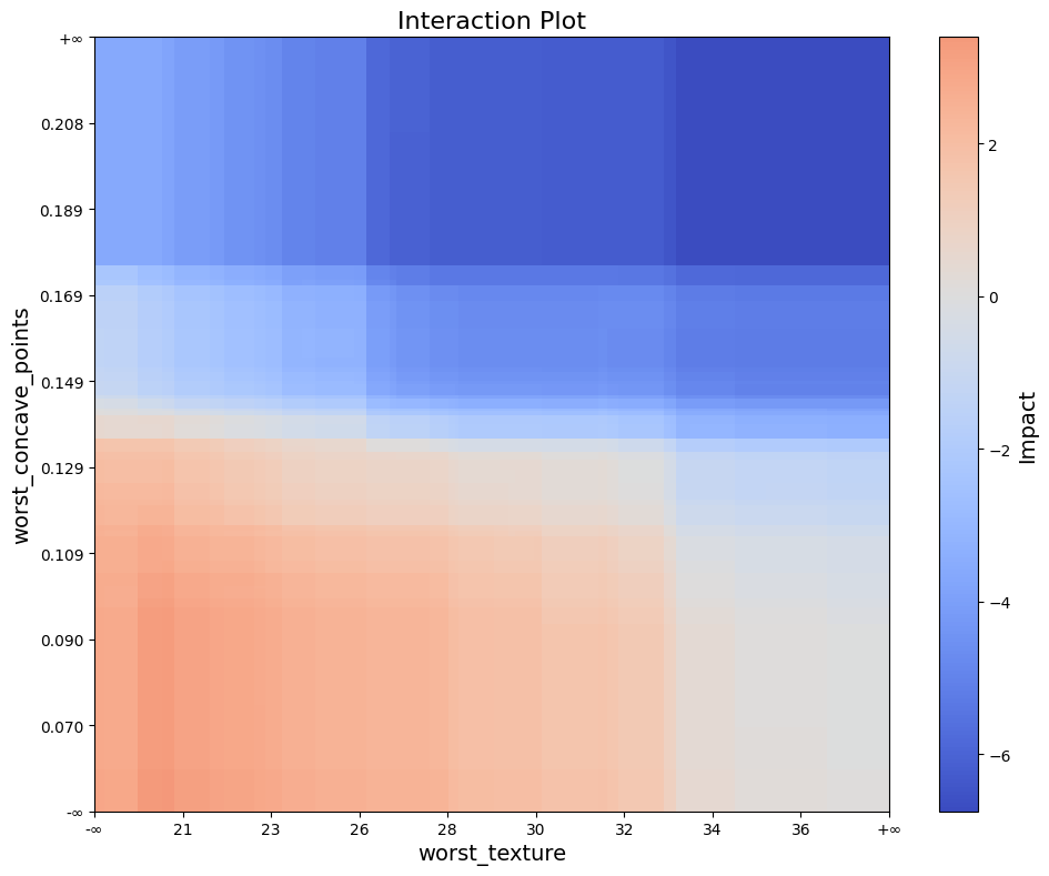
- treemind.plot.interaction_plot(df, figsize=(10.0, 8.0), axis_ticks_n=10, ticks_fontsize=10.0, title_fontsize=16.0, label_fontsizes=14.0, title=None, xlabel=None, ylabel=None, color_bar_label=None)
Creates a heatmap-style plot to visualize feature interactions. Each rectangle represents an interaction region, with its color indicating the interaction value.
- Parameters:
df (pd.DataFrame) – A DataFrame containing interaction data with columns _lb, _ub, _lb, _ub, and value. The first four columns represent intervals for two features, where each pair (_lb, _ub) defines the bounds of one feature. The last column, value, contains the interaction values for each pair.
figsize (tuple of float, default (10.0, 6.0)) – Width and height of the plot in inches.
axis_ticks_n (int, default 10) – Number of ticks on both axis
ticks_fontsize (float, default 10.0) – Font size for axis tick labels,
title_fontsize (float, default 16.) – Font size for plot title, by
title (str, optional, default None) – The title displayed at the top of the plot. If None, no title is shown.
xlabel (str, optional, default None) – Label for the x-axis. If None, it will default to the feature name.
xlabel – Label for the y-axis. If None, it will default to the feature name.
color_bar_label (str, optional, default None) – Colorbar label, If None, it will default to “Impact”.
label_fontsizes (float)
ylabel (str | None)
- Returns:
Displays the plot.
- Return type:
None
Example Usage
Below is an example of how to use the interaction_plot function:
from treemind import Explainer
from treemind.plot import interaction_plot

# Assume 'model' is a trained lightgbm or xgboost or catboost model object

# Create an instance of the Explainer
explainer = Explainer()
explainer(model)

# Analyze the specified feature by its index
df = tree.analyze_feature([22,21])

# Plot the feature using a line plot
interaction_plot(df)
Output
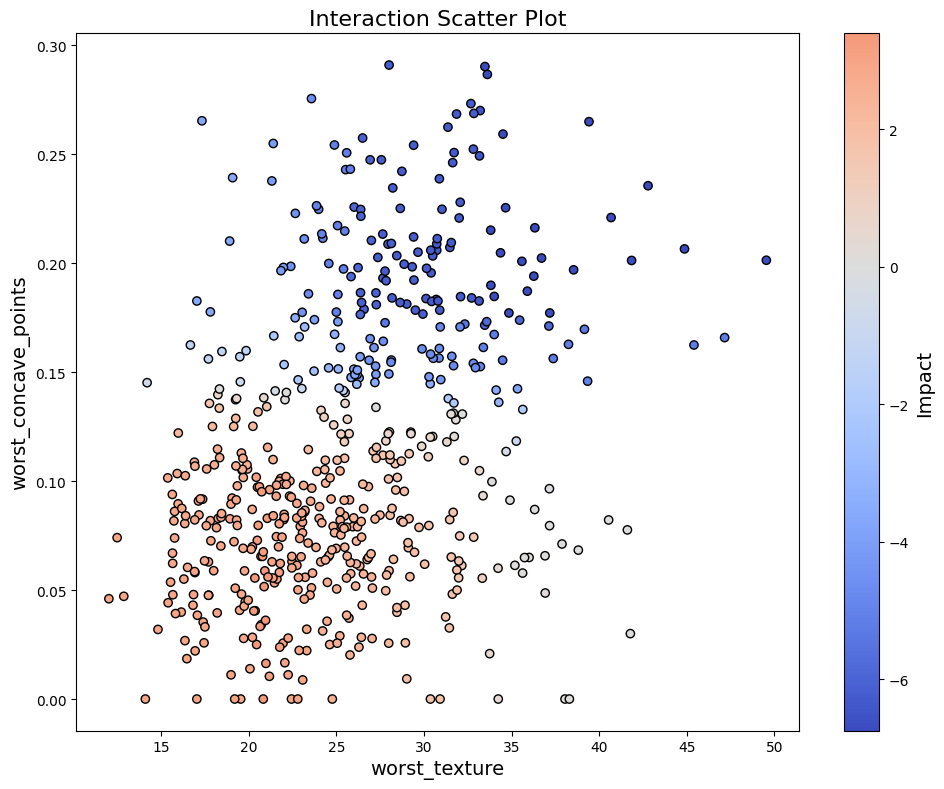
- treemind.plot.interaction_scatter_plot(X, df, col_1, col_2, figsize=(10.0, 8.0), ticks_fontsize=10.0, title_fontsize=16.0, label_fontsizes=14.0, title=None, xlabel=None, ylabel=None, color_bar_label=None)
Creates a scatter plot of feature values with colors representing interaction values.
- Parameters:
X (pd.DataFrame) – Input data containing feature values
df (pd.DataFrame) – A DataFrame containing interaction data with columns _lb, _ub, _lb, _ub, and value. The first four columns represent intervals for two features, where each pair (_lb, _ub) defines the bounds of one feature. The last column, value, contains the interaction values for each pair.
col_1 (int) – Index of first feature in X
col_2 (int) – Index of second feature in X
figsize (tuple of float, default (10.0, 6.0)) – Width and height of the plot in inches.
ticks_fontsize (float, default 10.0) – Font size for axis tick labels,
title_fontsize (float, default 16.) – Font size for plot title, by
title (str, optional, default None) – The title displayed at the top of the plot. If None, no title is shown.
xlabel (str, optional, default None) – Label for the x-axis. If None, it will default to the feature name.
xlabel – Label for the y-axis. If None, it will default to the feature name.
color_bar_label (str, optional, default None) – Colorbar label, If None, it will default to “Impact”.
label_fontsizes (float)
ylabel (str | None)
- Return type:
None
Example Usage
Below is an example of how to use the interaction_scatter_plot function:
from treemind import Explainer
from treemind.plot import interaction_scatter_plot

# Assume 'model' is a trained lightgbm or xgboost or catboost model object

# Create an instance of the Explainer
explainer = Explainer()
explainer(model)

# Analyze the specified feature by its index
df = tree.analyze_feature([22,21])

# Plot the feature using a line plot
interaction_scatter_plot(X, df, 22, 21)
Output