Usage
This example demonstrates how to configure and use the Explainer with a simple lightgbm model trained on the Breast Cancer dataset.
The Explainer is compatible not only with lightgbm but also with xgboost, catboost, sklearn, and perpetual models.
For more detailed information, please refer to the API Reference.
Setup Code
from lightgbm import LGBMClassifier
from sklearn.datasets import load_breast_cancer
from sklearn.model_selection import train_test_split

from treemind import Explainer
from treemind.plot import (
    feature_plot,
    interaction_plot,
    interaction_scatter_plot,
    importance_plot
)

# Load the dataset
X, y = load_breast_cancer(return_X_y=True, as_frame=True)

# Train a LightGBM model
model = LGBMClassifier(verbose=-1)
model.fit(X, y)
Once the model has been trained, it can be analyzed using the Explainer.
Initializing the Explainer
After training, initialize the Explainer with the model:
explainer = Explainer(model)
Counting Feature Appearances
The count_node method analyzes how frequently features (or feature pairs) are used in the model’s decision splits.
This is useful for identifying which features most influence the model’s predictions.
To count how often each individual feature appears in splits:
explainer.count_node(degree=1)
| column_index | count |
|--------------|-------|
| 21           | 1739  |
| 27           | 1469  |
| 22           | 1422  |
| 23           | 1323  |
| 1            | 1129  |
To analyze feature-pair interactions in splits:
explainer.count_node(degree=2)
| column1_index | column2_index | count |
|---------------|---------------|-------|
| 21            | 22            | 927   |
| 21            | 23            | 876   |
| 21            | 27            | 852   |
| 1             | 27            | 792   |
| 23            | 27            | 734   |
Analyzing Features
The explain function generates a Result object that summarizes statistical metrics for individual features or feature interactions based on the model’s decision splits.
To perform a one-dimensional (single feature) analysis:
result1_d = explainer.explain(degree=1)
To perform a two-dimensional (feature interaction) analysis:
result2_d = explainer.explain(degree=2)
The returned Result objects (result1_d and result2_d) contain computed statistics across the model’s decision trees. You can index into them to inspect metrics for a specific feature or feature pair.
One-Dimensional Feature Analysis
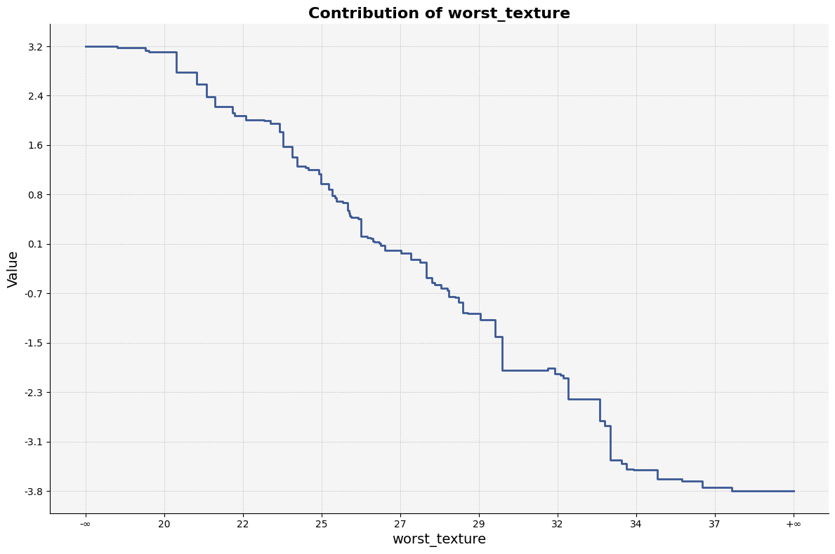
To access the analysis for a particular feature (e.g., feature index 21):
result1_d[21]
| worst_texture_lb | worst_texture_ub |   value   |   std    |  count  |
|------------------|------------------|-----------|----------|---------|
| -inf             | 18.460           | 3.185128  | 8.479232 | 402.24  |
| 18.460           | 19.300           | 3.160656  | 8.519873 | 402.39  |
| 19.300           | 19.415           | 3.119814  | 8.489262 | 401.85  |
| 19.415           | 20.225           | 3.101601  | 8.490439 | 402.55  |
| 20.225           | 20.360           | 2.772929  | 8.711773 | 433.16  |
To visualize the result of a specific feature:
feature_plot(result1_d, 21)
To retrieve the importance scores as a DataFrame:
result1_d.importance()
|   feature_0            |  importance |
|------------------------|-------------|
| worst_concave_points   |   2.326004  |
| worst_perimeter        |   2.245493  |
| worst_area             |   1.943674  |
| mean_concave_points    |   1.860428  |
| worst_texture          |   1.452654  |
To visualize feature importance:
importance_plot(result1_d)

Two-Dimensional Feature Interaction Analysis
To inspect interaction effects between two features (e.g., indices 21 and 22):
result2_d[21, 22]
| worst_texture_lb | worst_texture_ub | worst_concave_points_lb | worst_concave_points_ub |   value   |   std    |  count  |
|------------------|------------------|--------------------------|--------------------------|-----------|----------|---------|
| -inf             | 18.46            | -inf                     | 0.058860                 | 4.929324  | 7.679424 | 355.40  |
| -inf             | 18.46            | 0.058860                 | 0.059630                 | 4.928594  | 7.679772 | 355.34  |
| -inf             | 18.46            | 0.059630                 | 0.065540                 | 4.923128  | 7.679783 | 355.03  |
| -inf             | 18.46            | 0.065540                 | 0.069320                 | 4.912888  | 7.682064 | 354.70  |
| -inf             | 18.46            | 0.069320                 | 0.069775                 | 4.912888  | 7.682064 | 354.70  |
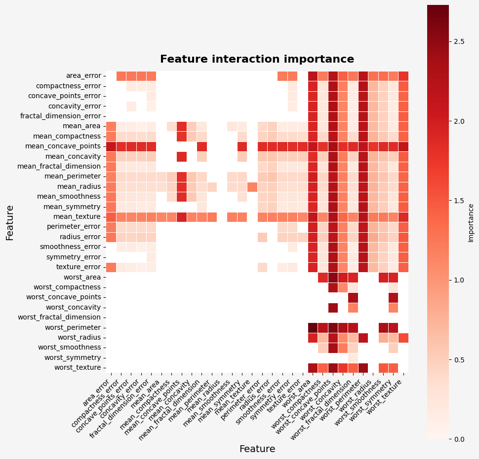
To retrieve importance scores from the two-dimensional result:
result2_d.importance()
|       feature_0         |       feature_1        | importance |
|-------------------------|------------------------|------------|
| worst_perimeter         | worst_area             | 2.728454   |
| worst_perimeter         | worst_concave_points   | 2.583406   |
| worst_area              | worst_concave_points   | 2.533335   |
| worst_texture           | worst_concave_points   | 2.439605   |
| worst_texture           | worst_perimeter        | 2.434743   |
To visualize the importance of feature interactions:
importance_plot(result2_d)
To visualize specific interactions using interaction_plot:
interaction_plot(result2_d, (21, 22))
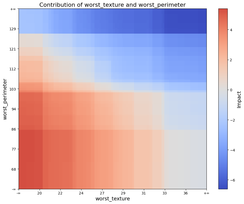
The interaction_plot creates a filled rectangle visualization using model split intervals, where color intensity reflects interaction strength.
To visualize interaction effects over actual data points:
interaction_scatter_plot(X, result2_d, (21, 22))

The interaction_scatter_plot overlays interaction scores on real input data to reveal how feature interactions manifest in the dataset.